Usage Charts — see the shape of your House's work
2026-06-03
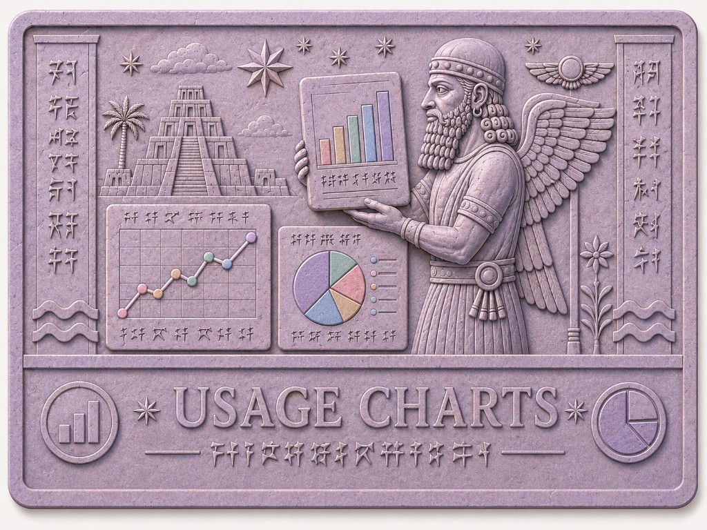
Impressions tells you what happened, row by row. Usage Charts tells you how much, over time — without exporting spreadsheets or adding up token counts by hand.
The House rolls metered usage into hourly metric buckets as work completes. Charts reads those buckets and draws them for you: cost estimates, token totals, and request counts, by day or by hour, for the range and scope you choose.
Open the room
You will find Usage charts in the app sidebar, beside Impressions (📊). The
room opens at /house/impressions/charts.
A link on the Impressions timeline also points here when you want to step back from individual rows to a summary view.
What the charts show
Charts are built from the same usage facts that feed Impressions — OpenRouter chat completions and Brave web searches — aggregated behind the scenes.
Cost (USD) is an estimate, not an invoice. LLM cost comes from OpenRouter usage metadata on each completion. Search cost uses a fixed rate per completed Brave search ($0.005 per search in the current formula). Treat the numbers as useful guidance for trends and comparisons, not as exact billing.
Tokens are split into input (prompt) and output (completion) — not a single combined total. That matches how models are priced and how you might reason about context growth versus reply length.
Requests counts discrete calls: one LLM completion or one search per row in the underlying usage stream.
Pick Daily or Hourly granularity. Daily suits longer ranges (up to a year). Hourly suits the last few weeks when you want to see spikes within a day.
Filter, scope, and apply
As with Impressions, the filter bar is deliberate. Set From and To, choose Granularity and Metric, then click Apply. The URL updates so you can bookmark a view.
Scope controls which aggregation you see:
- House — everything attributed to your House in that period.
- Provider — OpenRouter only, or Brave only.
- Servitor — one servitor's share of usage (select from the list).
For cost, Cost series lets you view Combined (LLM + search on one chart), LLM only, or Search only. Summary cards above the chart show the matching totals for the filtered range.
Legend colours distinguish OpenRouter from Brave search, and input from output tokens when both appear on the same chart.
How this relates to Impressions
Impressions remains the place for inspection: a single call, a payload, an audit event. Charts is the place for shape: "Was yesterday heavier than last week?" "Did search cost jump when we turned on a new workflow?"
If a chart looks empty, check that your date range includes days when the House actually ran metered work, and that scope matches what you expect (House-wide versus one servitor). You can always drop to the Impressions timeline with the same filters in mind and confirm the underlying rows.
What this is not
Usage Charts does not replace your OpenRouter or Brave dashboards. It does not enforce budgets or send alerts. Export and production-wide rollout of metrics infrastructure are still evolving — on dev, charts reflect what has been aggregated for your House.
For now, if you want a calm picture of cost, tokens, and volume over time — impressed into bars and lines instead of clay tallies — start with Usage Charts.